Wallpapers That Make You Say “Woah”: Pairing Creative Wallcoverings with Bold Light Fixtures
January 10, 2019
It’s been great seeing the creativity infusing the wallpaper world with new zest. Timorous Beasties, Abnormals Anonymous, Cole & Son, Anthropologie, Ashley Woodson Bailey, Hygge & West, Lulu & Georgia—just to name a few—have been absolutely killing it. (Emily Henderson did a nice round-up here.) From single image pieces to updates on toile to things that have textural appearance to geometrical to symmetrical to asymmetrical to chinoiserie to huge sensuous flowers on dark backgrounds to soft natural tones to glinting golden lines to animals, there are so many options out there now. (I’m out of breath just writing that.)
For a long time, wallpaper was used by those inclined to do so, but it wasn’t a popular choice, and there might even have been an attitude that it was somehow inferior to paint. But now, wallcoverings have become re-energized with new ideas that are setting spaces apart. An arty sensibility and a playful boldness have banished any connotation of boringness or backgroundness it might have had.
Looking to breathe new life into a room and give it a whole new look? The combination of a contemporary wallpaper and a wow-worthy light fixture could do just the trick.
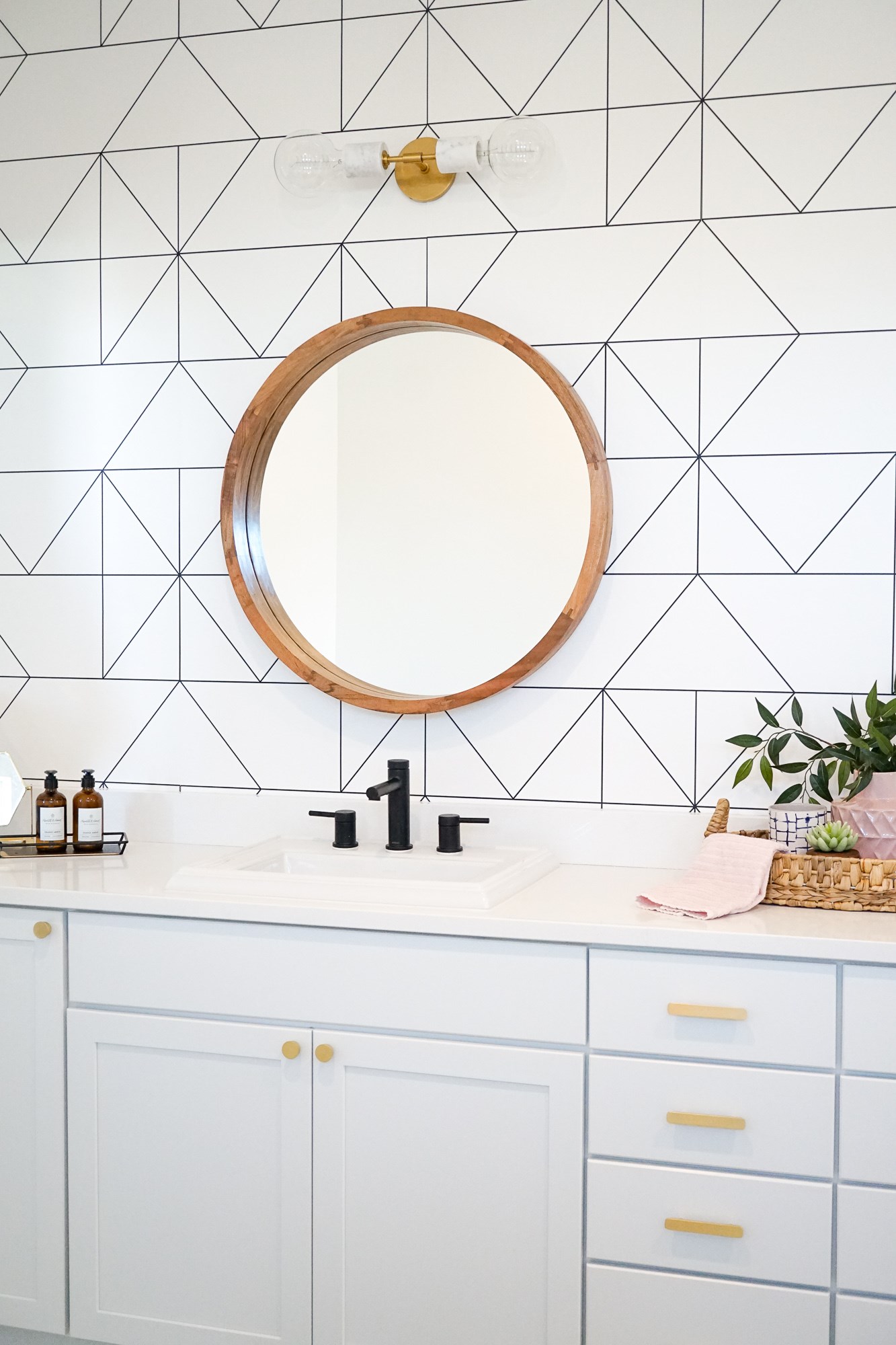
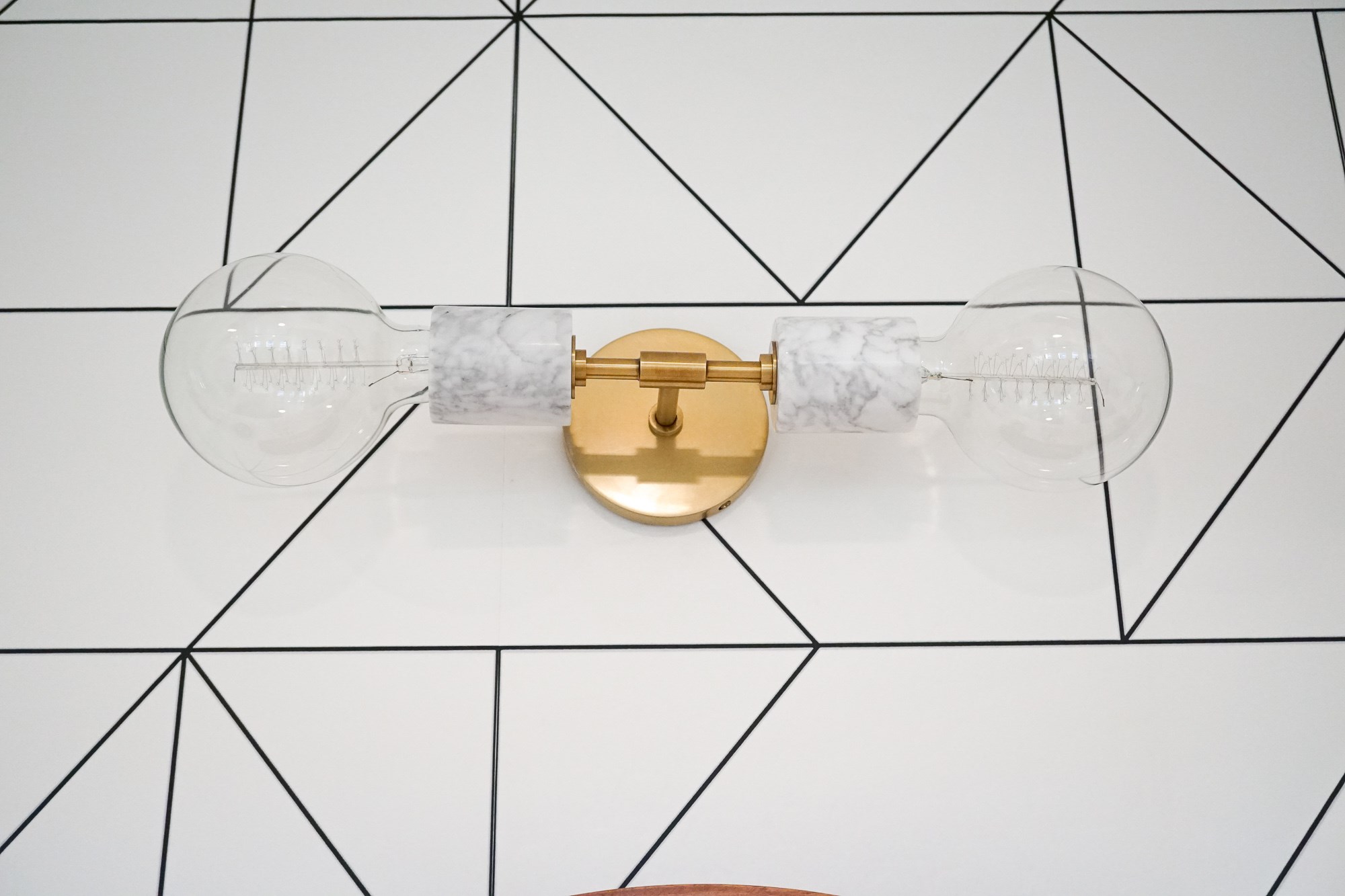
There are contradicting opinions. On the one side, you have notions like ‘Make sure you love the wallpaper. Replacing it is hard.’ On the other, you’ve got, ‘Well, not really. Replacing it is easier these days, depending on what options you go with.’ Some designers suggest that the key to using wallpaper is restraint: ‘Do one or two rooms before committing to more than that.’ Others say ‘Go big or go home!’ Similarly, some suggest an accent wall while others say ‘H-E-doublehockeysticks no.’ (Accent walls, as we’ve covered, can be a divisive subject). The question is no longer ‘Will I still love this in 10 years?’ but ,’Is this going to be great for 5 years?’ Let’s face it: There’s no way of knowing. Just jump in.
Interior designer Betsy Helmuth says, “Go the distance. You want to make a statement, make a statement,” arguing that using wallpaper for an entire room is era-appropriate. “The way you do paper is you do a whole room.”
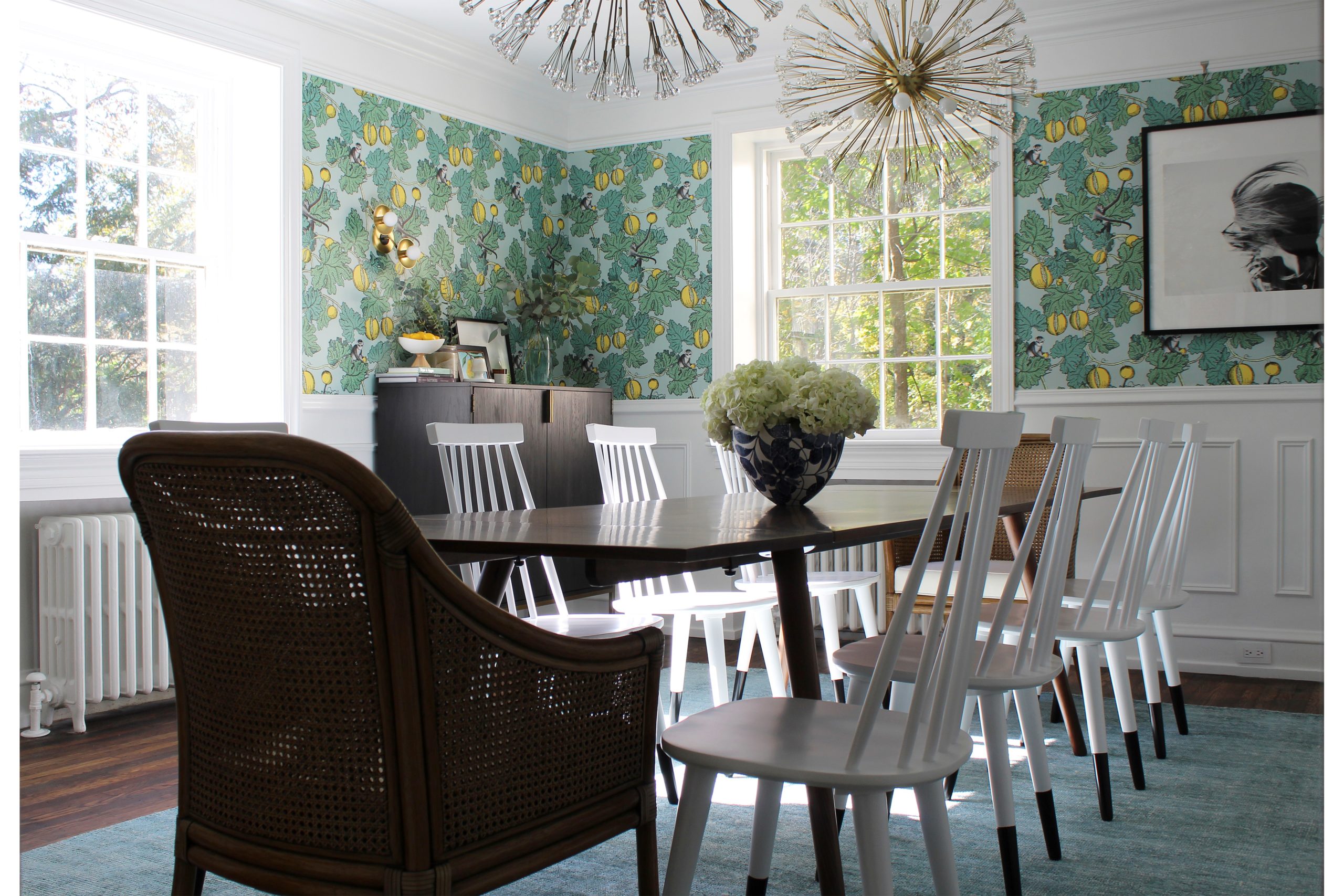
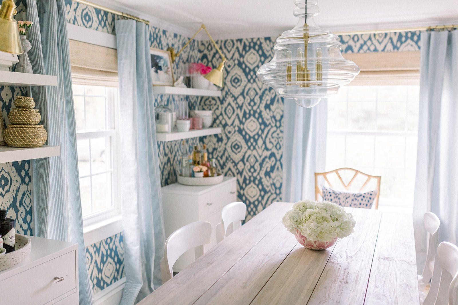
Are you considering doing a wallpaper refresh? A few things to consider before plunging in.
First off, hire a pro installer. Get it right the first time; get the best look; avoid waste; prevent buying an outrageous yardage.
Second, prep the surface it’s going to go on. The wall may require considerable sanding, spackling, and evening out.
Thirdly, consider angles in your placement. Is it an old room where planes don’t meet at a sharp perpendicular angle? This can create a bad look. Wallpaper works best when everything meets neatly and every situation has been prepared for, including where the repeats in the pattern happen and where windows and doors will interrupt it.
This article from the Washington Post covers a lot of the practical advice stuff pretty well.
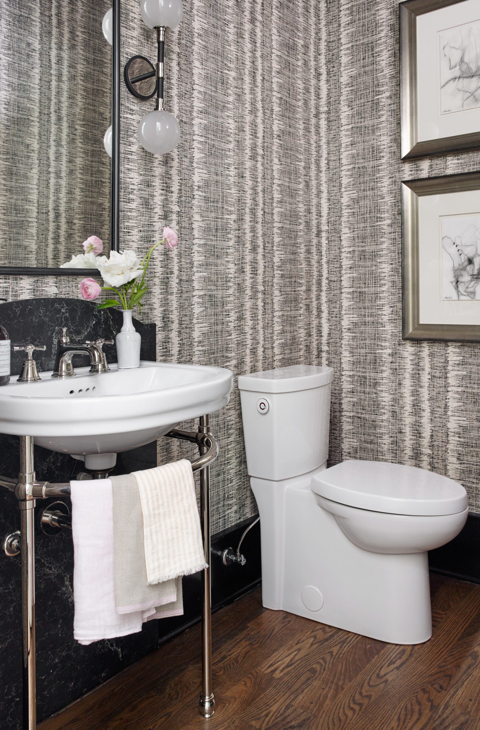
Let’s say you do want to start small, try it out as an experiment. Powder rooms are one of the best places for wallpaper. The small area to cover makes it an inexpensive lark with the possibility of an aesthetic payoff that is big.
It’s also a place where you indulge yourself in something whimsical, something dramatic. Since a powder room is not really a space you
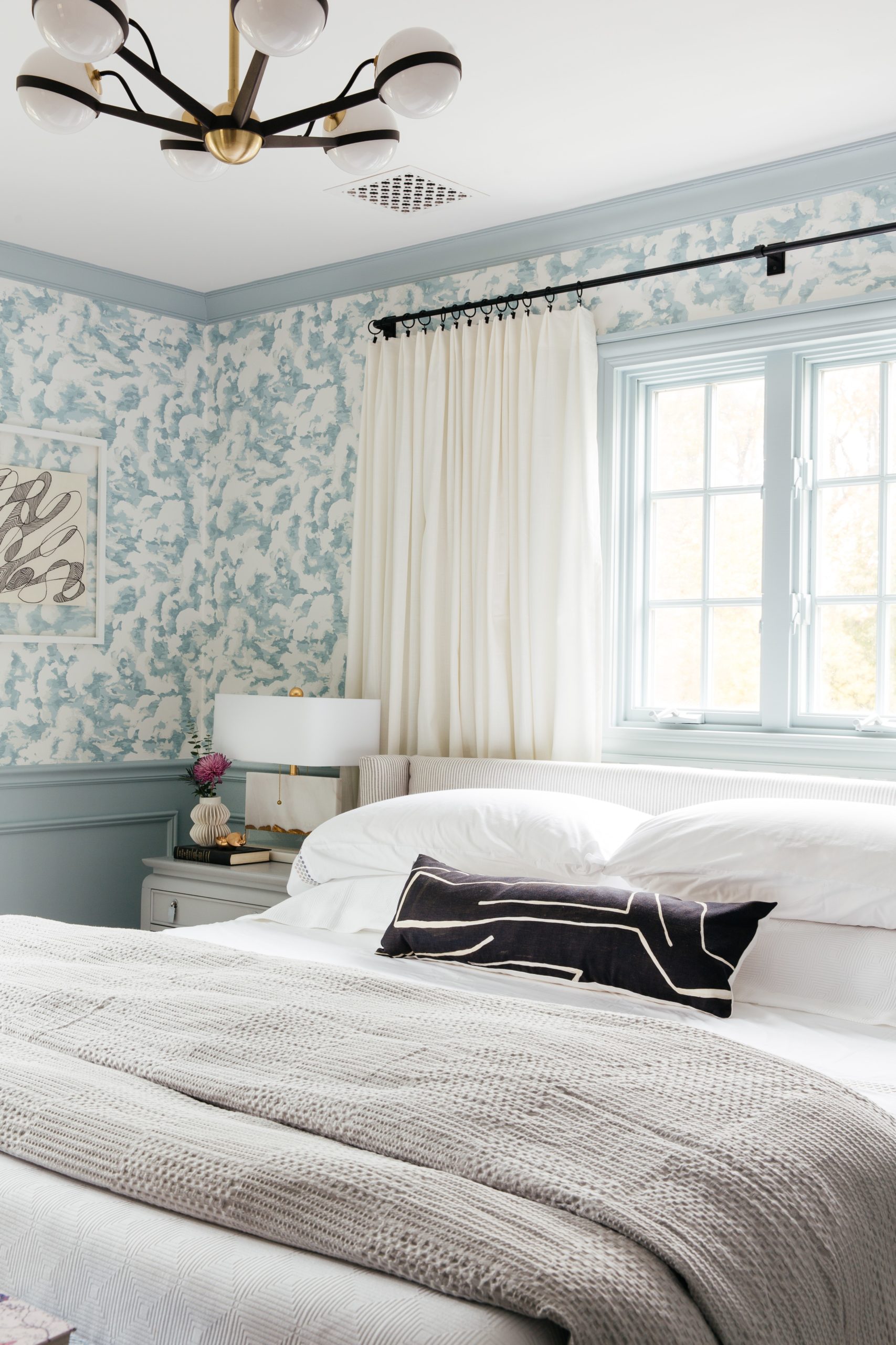
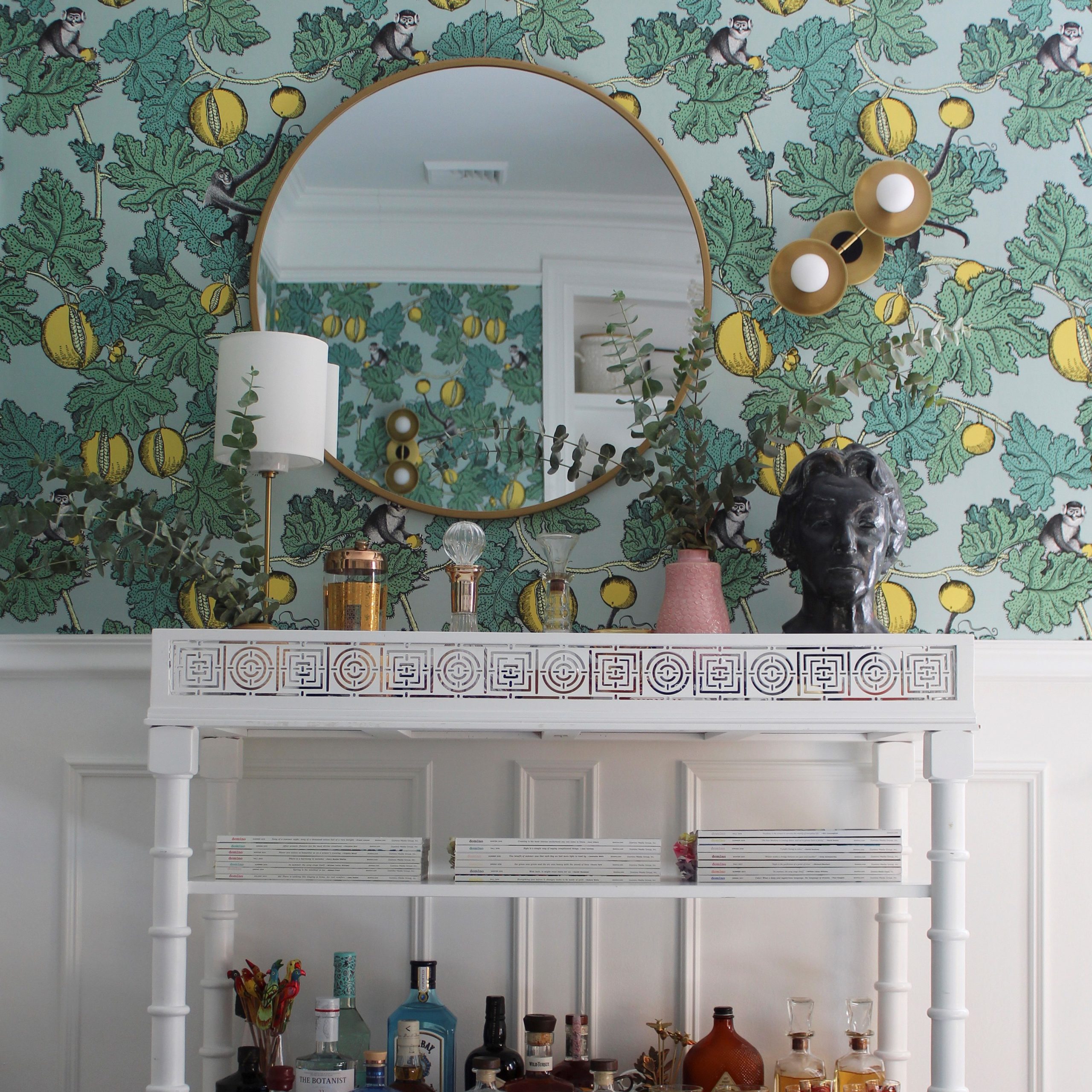
Another brilliant way to apply wallpaper (and a way to use it so that it’s not the whole room) is to combine it with wainscoting. Wallpaper used this way, offset by crown
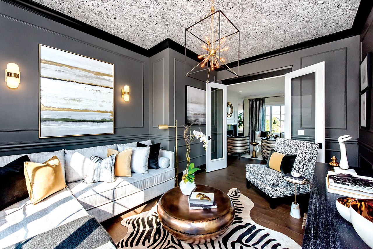
But just because it’s called wallpaper doesn’t mean it has to have to go on the wall.
Using wallpaper on the ceiling creates an unexpected element that lifts your head as well as elevates the whole space. Often barely considered when putting a room together, giving the ceiling attention may prove transformative, as seen here.
In this space by Curtis Elmy of Atmosphere ID, the grey, brass, black, and white scheme is lifted by the stunner of the ceiling with our eye-catching two-tone Glendale in the center.
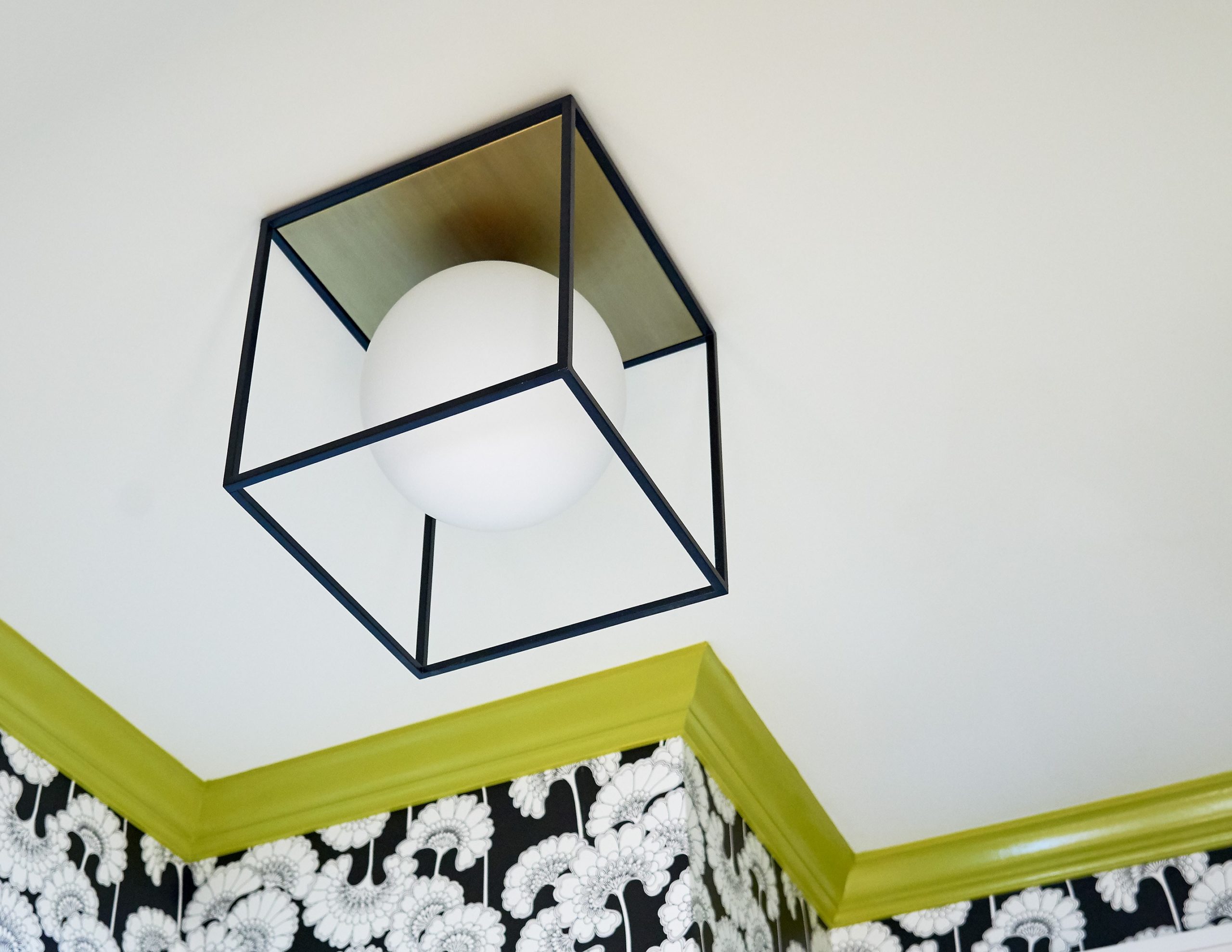
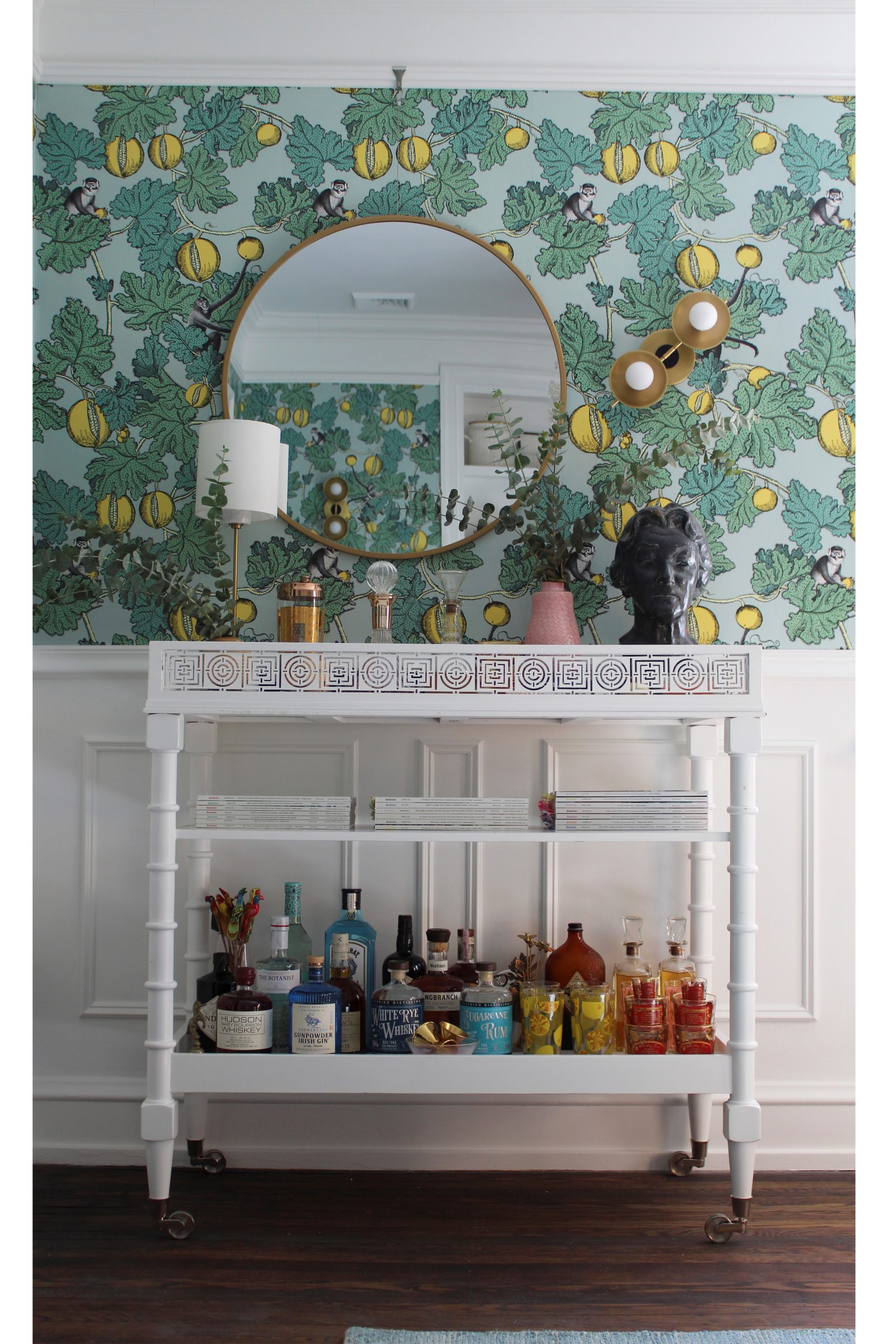
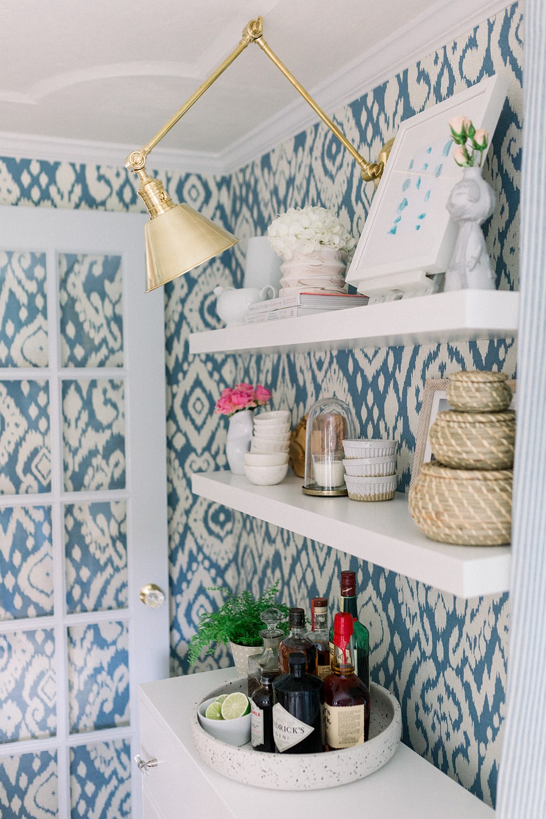
The right combination of a bold wallpaper and a bold light fixture which complement each other is a sure-fire way to energize a room with a needed dose of the unexpected.
Posted by Hudson Valley Lighting Group www.hvlgroup.com
